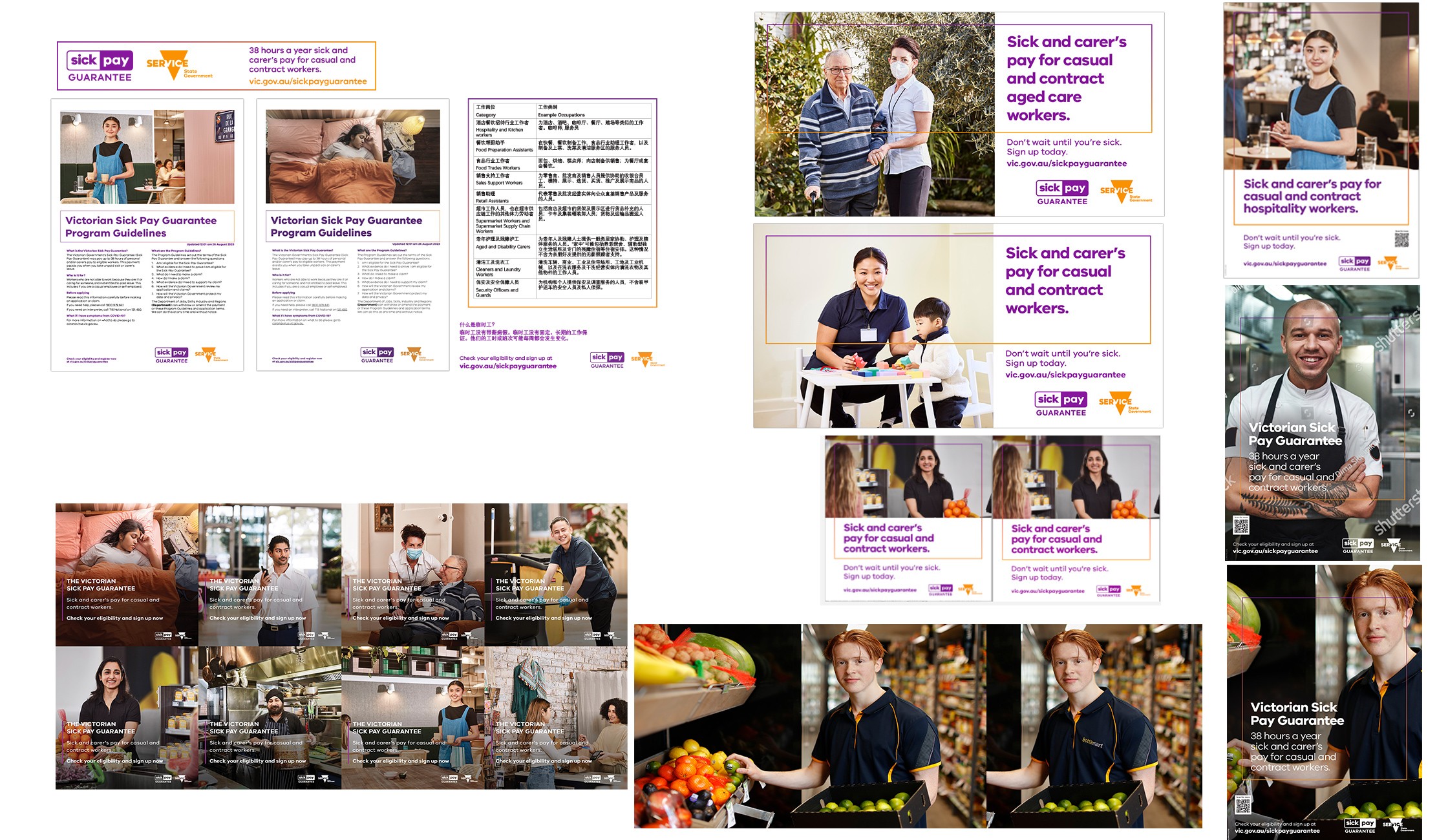
Sick Pay Guarantee brand, user experience and campaigns
Background
The Sick Pay Guarantee was a Victorian Government pilot program that provided eligible casual and contract workers with up to 5 days (38 hours) of paid sick and carer's leave per year at the national minimum wage.
(Launched in March 2022). Funded entirely by the state, the program was designed for workers in insecure jobs so they would not have to choose between their health and paying rent. It aimed to reduce workplace injuries, limit the spread of contagions, and relieve pressure on the healthcare system. The program ended up paying out $93.81 million to eligible workers.
A 2024 review of the pilot program is here >>
I was seconded from the COVID-19 Response in May 2022 to have a look at the program, as it was not going well. It was a multi-million-dollar program with low uptake, and the program Director and the Minister requested an investigation into its poor performance. The web pages were built in the Victorian Government CMS (Single Digital Presence/Drupal) using the ripple design system. Eligible workers were not completing the online sign-up process, which was hosted on the Service Victoria App and Website.
My role
I was initially responsible for:
Audit and improve the public web presence
Identify barriers to sign-up
Enhance usability, accessibility and readability
Ensure content meets quality, style and accessibility standards
Increase conversions and user confidence
Make the web presence align more closely with the print visual style guide
Additional responsibility:
Undertake analysis, content updates and stakeholder collaboration within tight timeframes.
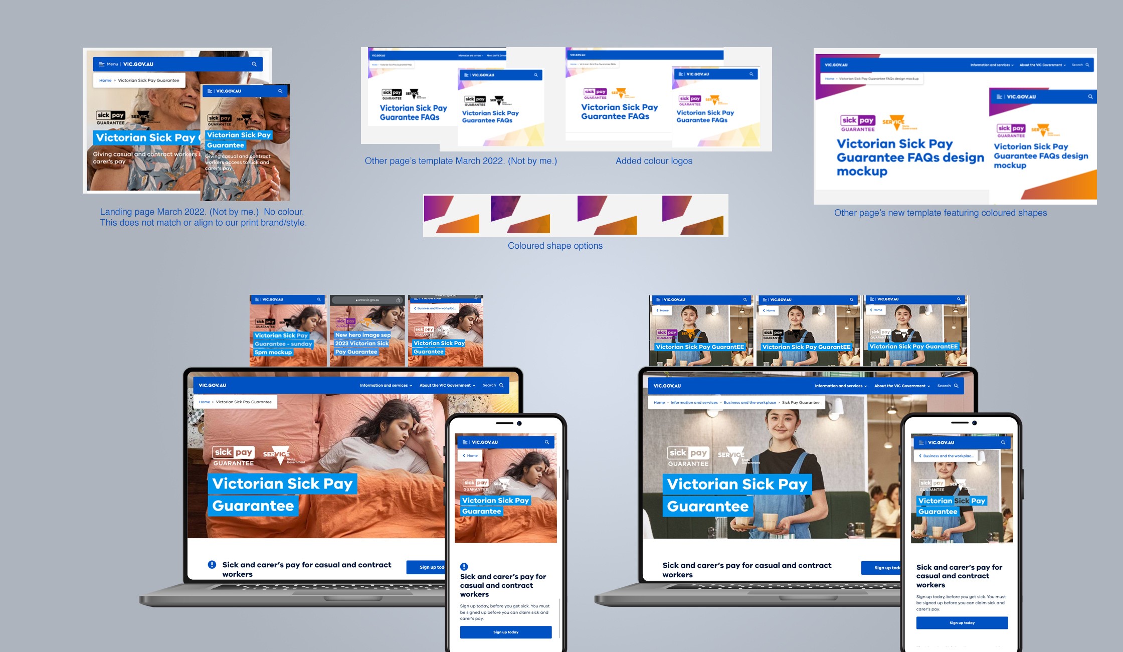
Bring in images and taglines from the new TV advertising campaign ("girl with the orange doona cover")
Responsibility for design and campaigns was added later, as you can see below.
In May 2022, I undertook a review of user experience and analytics.
After reviewing Google Analytics, I noticed:
Users spend a very long average time on the home page.
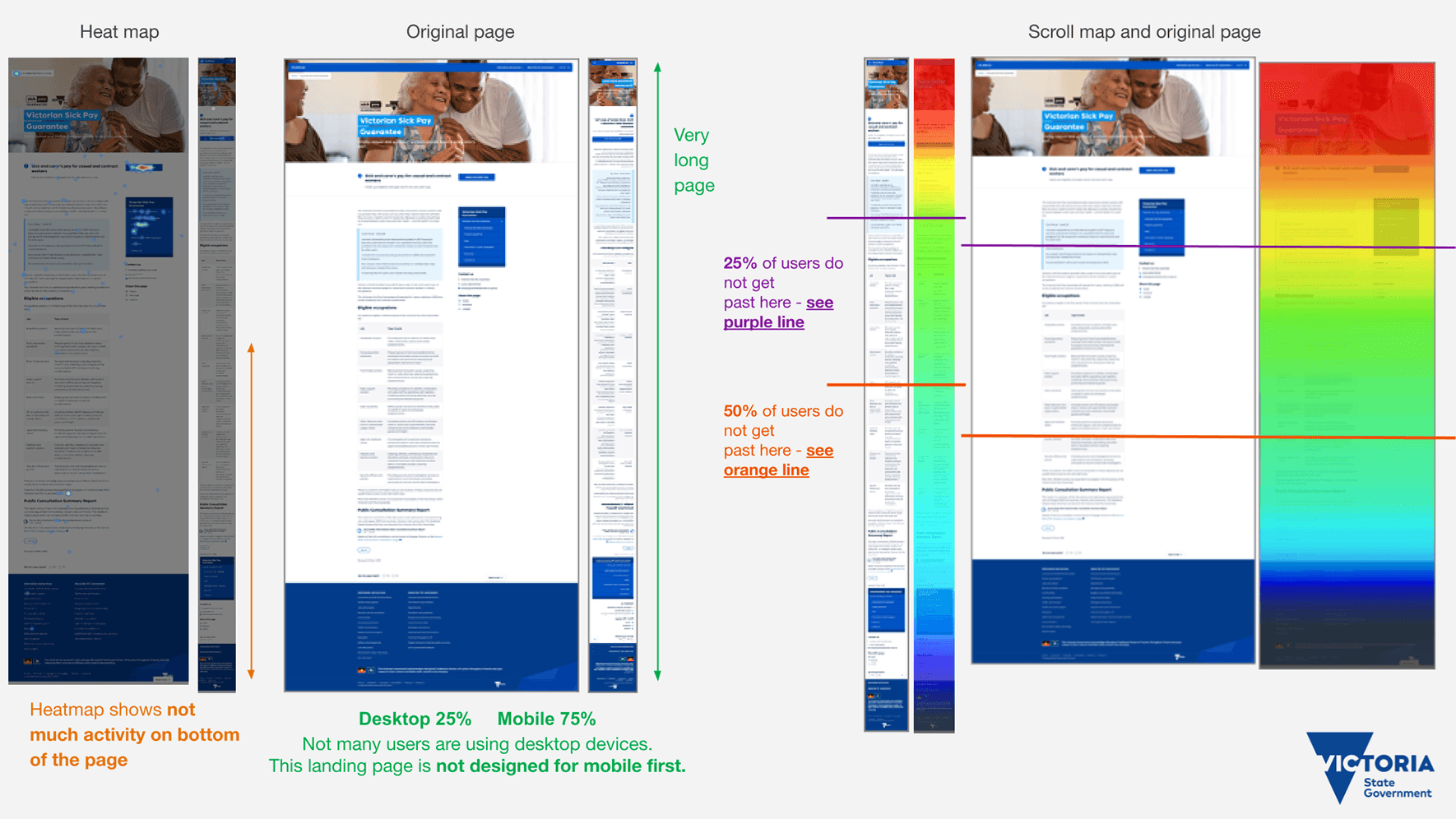
It was designed for desktop, but 75% of the audience was on mobile, with only 25% on desktop.

Looking at the Hotjar App, I saw:
Most users were not scrolling to the end of the page, missing important information.
25% of users do not get past here – see purple line
50% of users do not get past here – see orange lineUsers got stuck at the top of the home page. This suggests the audience is unsure about what to do next, and the page's lack of information on eligibility requirements made it confusing for users.
Looking at Google Search, I noticed:
The FAQ page was the second most popular page in search and the page had more FAQ questions than any other similar program. So users were confused about the program.
Checking ‘Plain English’ and Readability Level with the Hemingway App I saw:
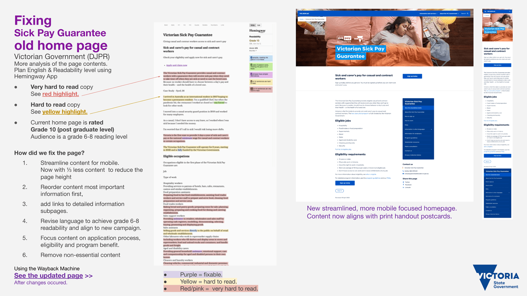
The homepage was written at Grade 10 level (postgraduate), but the audience reads at a Grade 6-8 level, so the content doesn't match their reading skills.
Very hard to read copy see red highlight.
Hard to read copy see yellow highlight.
The website didn’t match the print artwork or style guide for the Sick Pay Guarantee. We didn’t look very professional or part of the same program.
How did I fix the problems?
I streamlined the homepage content with mobile in mind, reducing it by ⅓. Removed all non-essential content. Reordered the content with key information first, concentrating on who the program is for, eligible jobs and other eligibility requirements.
Added stronger messaging and a Call-To-Action button directing users to the Service Victoria website to sign up for the program.
Revised language on all pages to achieve grade 6-8 readability.
Working with the Comms Team, we looked at Hotjar user heatmaps of the most popular questions on FAQ page. We created new How-to Sign Up and How-to Claim web pages. I sourced helpful photos, eg a sample driver's licence, passport, etc. I linked to these pages from the revised homepage.
I created a new SPG website theme for all web pages that aligned with the print artwork. I also added the “girl in bed with orange doona cover” TV ad campaign image to the homepage to keep the look consistent.
I created many webpage mock-ups and tested out different ideas. Working at the SPG booth at the Missumma Festival, I noticed we lacked a useful print guide for eligible jobs. Working with the Community Engagement team, we developed an A3 Jobs Poster that highlighted industries and eligible jobs.
To improve the web user experience for the “phase 2” expansion of the program, we could do something similar to the Jobs Poster by adding “group headings” (industries) and grouping similar jobs together. I had a bigger plan for the print material to match the revised web page exactly, but I couldn't get it approved by the managers and directors.
Updated the Program Guidelines web page and InDesign booklet. I added small improvements to each major update to make it more user-friendly. I wanted to add “group headings” (similar to the How to sign up web page), but unfortunately I couldn't convince the executive team of the idea's merit.
See program homepage >>
Before changes were made to the landing page
See the updated program homepage >>
After the changes were made to the landing page (homepage), I investigated what people were looking at on the FAQ page by using HotJar heatmaps (see below).
This helped us develop the new How-to-sign-up and How-to-claim pages.

Overall result
I helped make the Sick Pay Guarantee web pages much more user-friendly, and they were voted the Top 20 Most Helpful Content in September 2023 (Victorian Government).
See Sick Pay Guarantee Pilot Evaluation report 2024
New and updated design outputs that enhance the SPG brand update campaigns and reporting.
My Role was to work on a number of different things:
Program Guidelines web page (September 2023). Updated content and improved the document's usability.
- See the original Program Guidelines (March 2022 PDF) - this was before I joined
- See my updated Program Guidelines (October 2022) PDF
- See my updated Program Guidelines (September 2023) PDF
Social media tiles phase 1 and phase 2 for many stakeholders. Created a few animated GIFs to add to the web resources page. Helped select photos from photo libraries and test them with print and social media artwork.
Creating mock-ups & trying out different graphic design ideas. This was for web pages, print and social media artwork.
Fixing colour problems (wrong colour profiles). Exported artwork from InDesign with fixes made by others. Created versions of artwork for different platforms.
Implementing new campaigns across web, social media and print. We changed the main campaign image several times.
Improved the branding & accessibility. I removed the SPG orange colour from our print work after discovering it doesn’t meet AA contrast accessibility requirements.
8. Proofreading & testing QR codes and web links on postcards and handouts.
9. Improving internal assets (rework the staff PowerPoint template and fix the email signature).
Giving feedback and suggestions on how we could improve the Service Victoria app and website. This involved writing improved copy, suggesting technical improvements and commenting on the latest Figma designs. See screen grabs below.
.Creating artwork from translated copy (from an agency), adding it to the website resources page. Then informing stakeholders and key groups about updates and changes.
Campaign and digital reporting to directors and ministers. Explaining how campaigns are going, what audiences we have, potential problems/risks and what we are doing to mitigate them. Below is a screenshot of a PowerPoint titled "Visitor parts to the main landing page" (homepage), given to directors and the Minister's office, on how the program is going.

Giving feedback and suggestions on the Service Victoria App Figma design.


Creating artwork from translated copy (from an agency), adding it to the website resources page, and informing stakeholders via PowerPoint presentations.

Social media sharing of artwork by Victorian Ministers I was involved in making.


Sick Pay Guarantee brand and user experience
Enhancing the Sick Pay Guarantee brand, website usability & content, and graphic design.